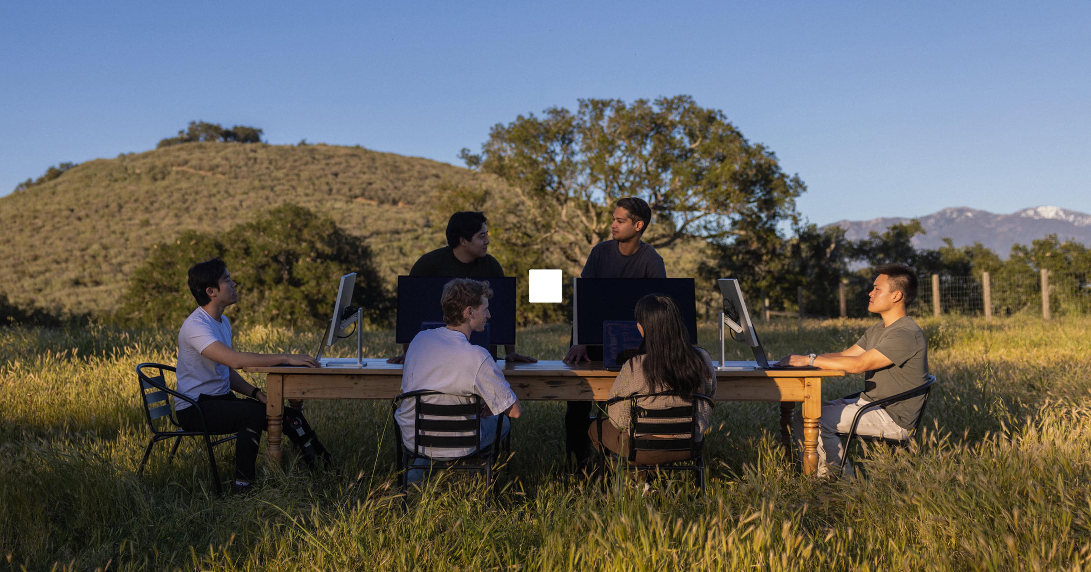
Natural brand manifesto
Currency has always been a designed object.
Every banknote in circulation today is the product of centuries of accumulated craft. Behind each note are a nation’s beliefs and values told through fine lines, deliberate textures, and the interplay of visible and hidden details. Currency’s deepest design principle is that complexity, rendered invisible, produces trust. That invisibility is not an accident. It's the highest form of design. And it's the idea at the heart of Natural’s visual identity.
Nature
Just as currency communicates trust through design, nature communicates permanence, familiarity, and neutrality. Nature is constant. Mountains, rivers, trees, earth: these elements ground value in something universally understood.
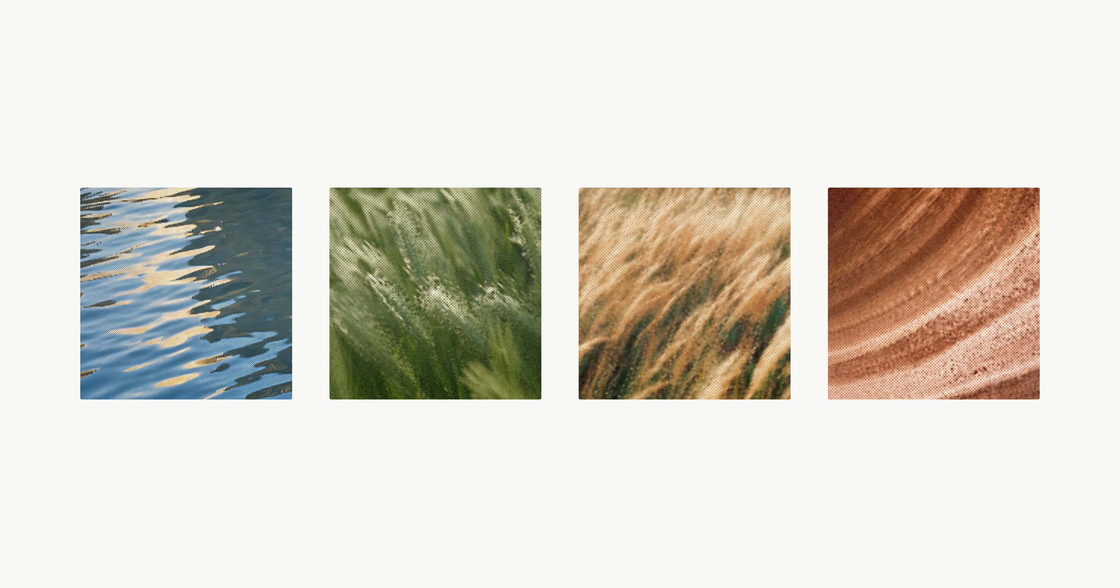
The veins of a leaf, ocean ripples, a vast desertscape, patterns in stone—these serve as motifs that bring our brand worlds to life. We use nature, and the small moments found within it, as symbols of our product promises: Intelligent, Fluid, Expansive, and Resilient.
Impressions
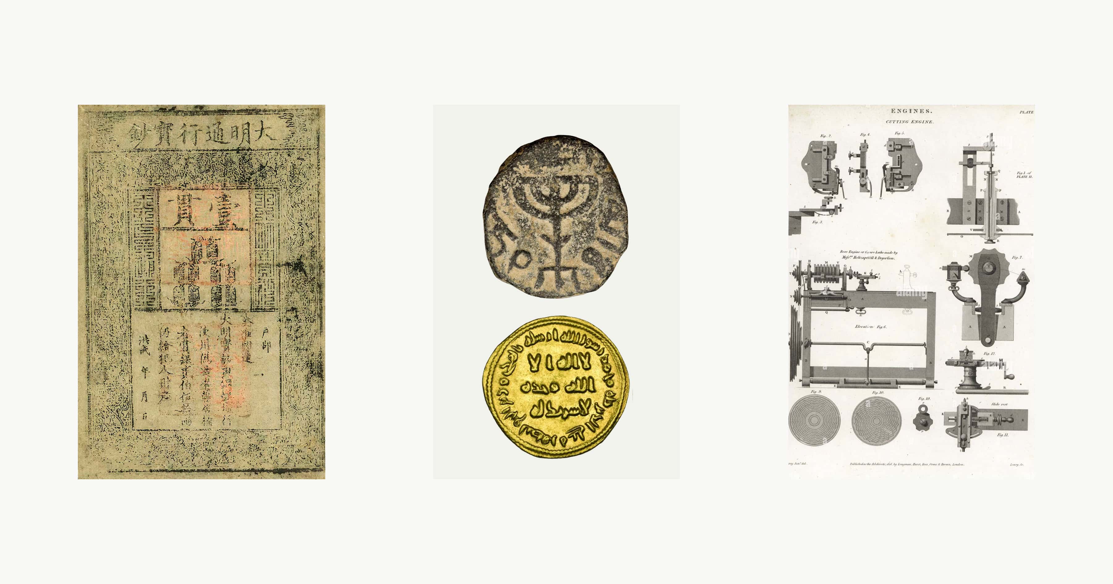
Each image in our identity system is, in a sense, a modern banknote. Seen from a distance it looks simple and quiet. But examine it closely, and it reveals itself with subtle dithering, fine-line textures, and guilloché patterns drawn from currency traditions across history.
We call these Impressions. Each of Natural’s Impressions draws from a specific tradition, time period, or printing method. They're not meant to be used all at once. Think of them as a palette of textures. They are individually subtle, collectively forming a visual system that bridges the natural world to the financial one.

Colors & space
Natural's color palette was sourced from two places: the landscape and the ledger. Midnight is a near-black with a trace of olive, like soil under low light. Linen is the surface of aged paper, like the shades of some of the older Yen and Franc notes. Stone and Charcoal are the grays between them. Graphite is the weight of ink. Ice is the absence of it all.
None of these colors announce themselves. The palette is there to make everything else feel inevitable. It’s also why we lean heavily into empty space. We think of the empty space not as aimless padding, but rather a surface on which the system rests. Our visual system avoids trend-driven expression in favor of forms and textures that feel inevitable.
When the Impressions, color palette and empty space converge, the result should feel familiar yet different in a way you can’t immediately explain.
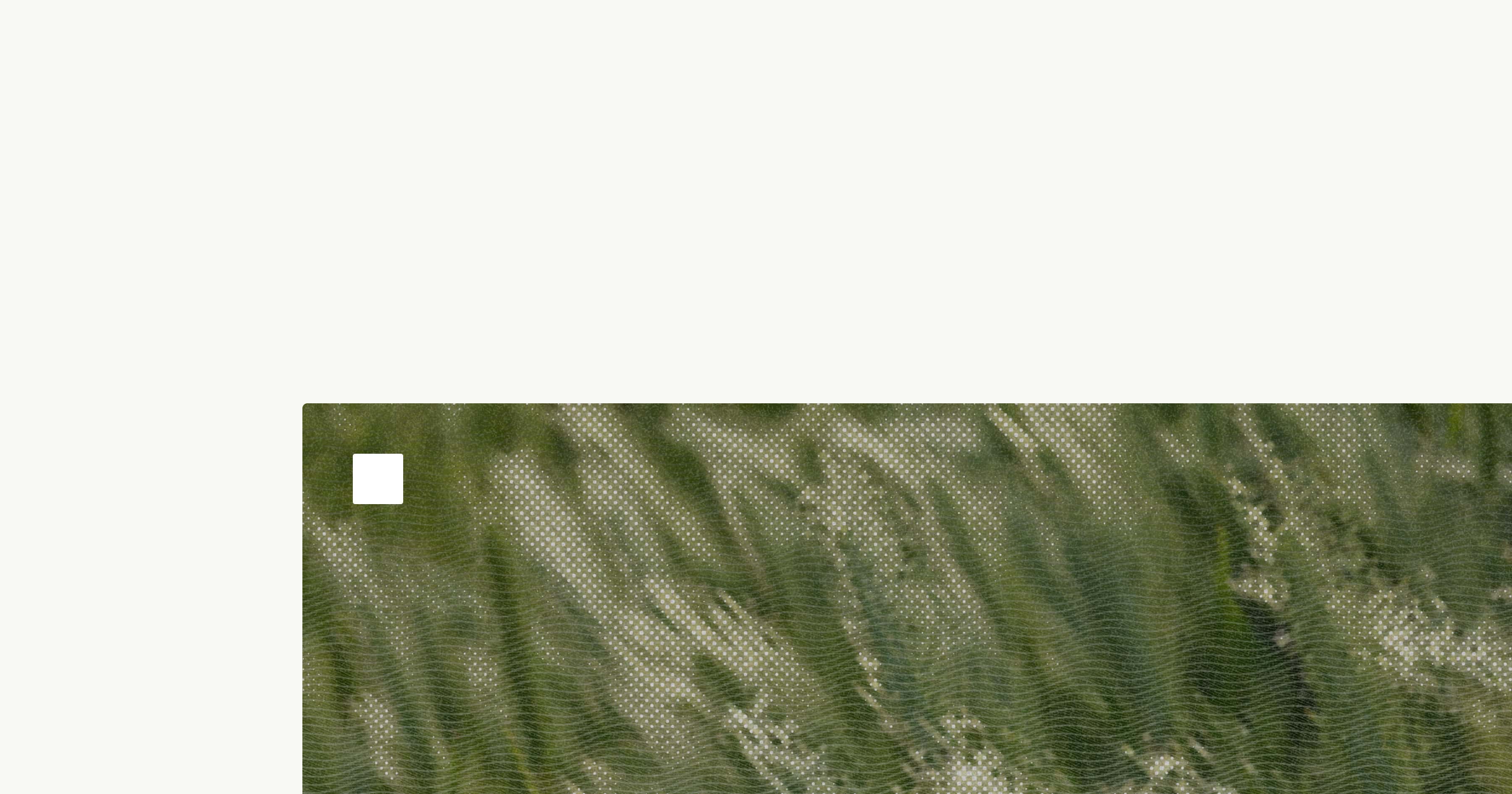
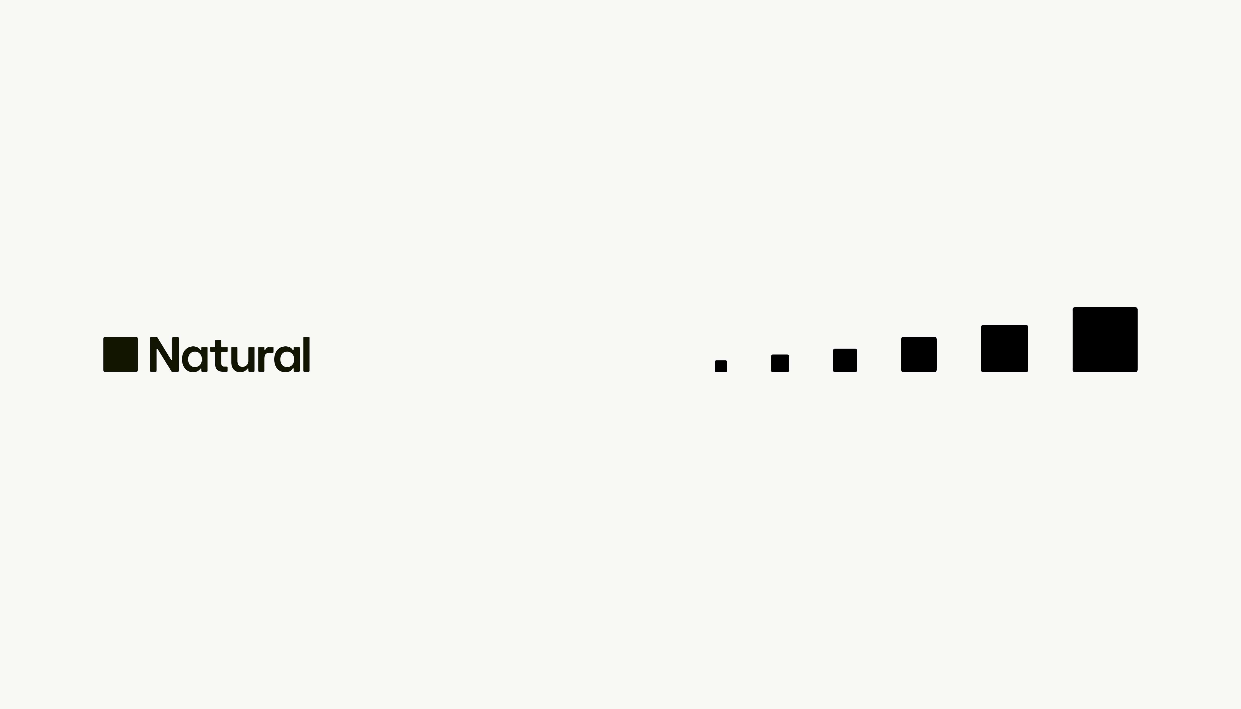
Brandmark
We went through hundreds of different brandmarks before landing on the one. In hindsight, what the iterations gave us was confidence in what our mark did not need.
The answer had been there from the beginning. Natural's original logo — before there was a product, before there was a brand — was a filled square and nothing more. We spent months trying to improve on it before realizing we were trying to improve on the right answer.
So we kept the square and turned it into a system. The icon now has a slight corner radius, enough to carry some delicateness while still feeling sharp and considered. It works alone, dropped anywhere, at any size. It does not need much to be effective and that’s the point.
Promise
Our brand is the Natural promise made visible. Its primary intention is not to explain what we do, but rather how we think. It reflects our deep commitment to building tasteful and performant software. We want Natural to look the way it works: considered, precise, quietly luxurious. The kind of thing that earns attention rather than demands it.
We plan on fulfilling our promise and if you’d like to help, consider joining us at /careers.